Cost Calculator for WordPress
974.610₫ Giá gốc là: 974.610₫.194.922₫Giá hiện tại là: 194.922₫.
Cost Calculator is an intuitive WordPress form builder for creating quote or calculation forms. Easily design price estimation forms to give clients an idea of project costs or service fees. The plugin includes a visual form builder, integrates with WPBakery Page Builder, and supports Stripe Payments for secure payments and subscriptions. Create calculators in no time.
Designed for: any website with a price structure on the product to create a quote form, project cost calculator or service cost calculator. To build a contact form or an order form with or without the estimation part. For price calculator, cost estimation forms. To create a product or service configuration form with or without a quote. For cost comparison and presentation of calculated values.
Latest Version: 27 August 2024 – v6.2. Check the changelog
Cost Calculator Pre-made Demos
Responsive Layout
Cost Calculator is fully responsive which means each and every plugin element adapts perfectly for any screen size.
Cost Calculator Form Builder
The plugin features an integrated drag-and-drop page builder that allows you to work with rows, columns, and components without the need for external plugins. All the tools are conveniently presented in a user-friendly interface, making form creation a breeze. You have the freedom to create an unlimited number of calculation forms, customizing them to suit your specific requirements.
Multiple Column Layouts / Drag & Drop
The plugin enables you to create your calculation form using a column-based layout effortlessly. It provides a variety of predefined layouts to choose from, all of which are fully responsive.
Stripe Payments Integration
You can integrate Stripe Payments directly into your forms. This means you can handle both one-time payments and subscriptions with ease and security. Choose from daily, weekly, monthly, or yearly recurring periods. Plus, set custom intervals like ‘pay every 2 weeks’. Decide between immediate redirection to the checkout form or sending a payment link via e-mail.
Predefined Layout Skins, Customizable Colors & Google Fonts
The plugin includes five predefined layout skins, offering different visual styles for your forms. Additionally, you have the flexibility to define your own colors by overriding the default settings. With hundreds of Google Fonts available, you can easily select the perfect typography to complement your forms.
Different Form Components
The plugin offers a wide range of form components, providing flexibility and versatility in your form-building process. These components include: Dropdown Box, Slider Box, Input Box (Type Text, Number, Email, Hidden, and Submit), Date Picker, Checkbox, Radio, Switch Box, Summary Box, and Contact Details Box. Each of these components can be freely configured.
Dropdown Box
This component allows you to create a dropdown select menu with customizable options. You can define the dropdown values and corresponding calculation values, set a default value or placeholder text, and make it mandatory if needed.
Options available:
- Set component ID.
- Set component name.
- Define label.
- Define whether to show or hide the label.
- Create a dropdown list.
- Define the number of dropdown options.
- Name the options and assign them values.
- Define the default value.
- Define whether to show placeholder text (e.g. “Choose…”).
- Define placeholder text.
- Set component as mandatory or not.
- Set top margin.
Slider Box
The Slider Box lets users slide and select a numeric value within a specified range. You can set the minimum and maximum values, define the step size, and even include additional input field for precise value entry. It also supports currency symbols, separators, and allows setting a default value.
Options available:
- Set component ID.
- Set component name.
- Define label.
- Define whether to show or hide the label.
- Set default value.
- Define the step and the value of a single step.
- Set the minimum and maximum values.
- Define whether to show or hide minimum and maximum range.
- Add an optional unit symbol before the value (e.g. currency).
- Add an optional unit symbol after the value.
- Set thousands separator.
- Show or hide input field.
- Set top margin.
- Set extra class name.
Input Box
With the Input Box, you can add various types of input fields such as text, number, email, checkbox, radio etc. You have control over labels, default values, placeholder text, and the option to make it mandatory or not.
Options available:
- Set component ID.
- Set component name.
- Set input type (text, number, date, email, checkbox, radio, hidden, submit).
- Define label.
- Define whether to show or hide the label.
- Set default value.
- Define placeholder text.
- Set component as mandatory or not.
- Set top margin.
- Set extra class name.
- Set ::after pseudo element class name.
Checkbox
The Checkbox component allows for the inclusion of checkboxes in your form. You can use multiple checkboxes side by side, enabling users to make multi-select choices. For instance, you can create a section for selecting additional services, with checkboxes representing various service options.
Options available:
- Set component ID.
- Set component name.
- Define label.
- Define whether to show or hide the label.
- Set default value if checked.
- Define whether is checked or not.
- Set checkbox style (classic or button).
- Set hidden text if checked.
- Set hidden text if not checked.
- Define placeholder text.
- Set component as mandatory or not.
- Set top margin.
- Set extra class name.
- Set ::after pseudo element class name.
Switch Box
This component provides a toggle switch where users can select between two options, typically representing “Yes” or “No.” You can customize the labels, set a default selection, and assign a value for calculations based on the switch state.
Options available:
- Set component ID.
- Set component name.
- Define label.
- Define whether to show or hide the label.
- Set labels representing “Yes” or “No” options.
- Set default value if checked.
- Define whether is checked or not.
- Set top margin.
- Set extra class name.
Date Picker
The Date Picker component allows users to pick a date from the calendar interface. Useful for date selections or appointment scheduling.
Options available:
- Set component ID.
- Set component name.
- Define label.
- Define whether to show or hide the label.
- Set default value.
- Define placeholder text.
- Set component as mandatory or not.
- Set top margin.
- Set extra class name.
- Set ::after pseudo element class name.
Summary Box
The Summary Box is used to display the calculated result based on the values entered in other form fields. You can create complex formulas using field IDs and mathematical operators. It supports customizable currency symbols, decimal and thousand separators, decimal places, and the ability to handle errors or negative results.
You can incorporate an unlimited number of summary box components in a single form, calculating and displaying multiple values simultaneously. This empowers you to create dynamic and comprehensive forms, showcasing various cost breakdowns, totals, or custom calculations.
Options available:
- Set component ID.
- Set component name.
- Create a formula.
- Add an optional unit symbol before the value (e.g. currency).
- Add an optional unit symbol after the value.
- Set unit symbol size (default, or upper small).
- Set thousands separator.
- Set decimal separator.
- Set the number of decimal places.
- Set options for rounding values.
- Set how to handle errors.
- Set how to handle negative values.
- Set description text.
- Set the icon (from the list).
- Set a label before the calculated value.
- Set extra class name.
Contact Details Box
This component is a simple form for collecting contact details from users. It can include fields like name, email, phone number, etc., to gather necessary information.
Options available:
- Set component label.
- Set submit label.
- Enter ‘name’ label.
- Enter ‘name’ placeholder text.
- Set ‘name’ field as mandatory or not.
- Enter ‘email’ label.
- Enter ‘email’ placeholder text.
- Set ‘email’ field as mandatory or not.
- Enter ‘phone’ label.
- Enter ‘phone’ placeholder text.
- Set ‘phone’ field as mandatory or not.
- Enter ‘message’ label.
- Enter ‘message’ placeholder text.
- Set ‘message’ field as mandatory or not.
- Set description text.
- Set whether to display form fields labels only, labels and placeholders or placeholders only.
- Set whether to show terms and conditions checkbox.
- Append data from another form (just enter the form ID).
- Set extra class name.
- Turn on or off reCaptcha.
WPBakery Page Builder Integration
If you already have the WPBakery Page Builder for WordPress plugin installed, you can leverage its benefits in conjunction with the Cost Calculator plugin. However, WPBakery Page Builder is not a requirement for using the Cost Calculator plugin, as it provides its own visual form builder.
Calculations Stored in the Database / Sent to an Email
The plugin securely stores all calculations and submitted forms in the database, making them accessible from the admin level. Additionally, it automatically sends the calculated results and form submissions via email. This ensures that the person submitting the form receives the calculated results, and the admin also receives a copy for reference.
One-Click Demo Importer
You can import pre-made demo content easily with a single click, via the Import Dummy Data manager and start working on existing forms.
Key Features of Cost Calculator for WordPress
- 100% responsive and mobile compatible.
- High resolution and pixel perfect.
- Unlimited calculation forms and submitted calculations.
- Visual drag-and-drop form builder built-in.
- Support for unlimited rows and multi-column layout.
- Stripe Payments integration for secure one-time and subscription payments.
- Support for subscription payments with custom intervals (e.g., daily, weekly, every 2 weeks).
- Choose between immediate checkout redirection or sending payment links via email.
- Enhanced form customization with individual settings for payment modes and recurring periods.
- Dynamic controls allow users to select payment periods and intervals during form completion.
- Set and manage payments in any currency for international transactions.
- Predefined and customizable email templates for both clients and admins.
- Detailed payment tracking and editable success, cancel, and subscription pages.
- 11 pre-made calculation forms included in demo content:
- Cleaning Cost Calculator.
- Renovation Cost Calculator.
- Car Service Cost Calculator.
- LPG Savings Calculator.
- Mortgage Cost Calculator.
- BMI Calculator.
- Web Hosting Cost Calculator.
- Web Design Cost Calculator.
- Calorie Calculator.
- Bookkeeping Calculator.
- Loan Calculator.
- 5 predefined skin templates.
- Color picker built-in.
- Font configurator built-in.
- Different form components:
- Dropdown Box.
- Slider Box.
- Input Box (Type Text, Number, Email, Hidden, and Submit).
- Date Picker.
- Checkbox.
- Radio.
- Switch Box.
- Summary Box.
- Contact Details Box.
- Securely stores all calculations and submitted forms in the database.
- Access to the submitted calculations from the WordPress admin panel.
- Sends calculations to an email.
- Possibility to modify the email template and recipients.
- WordPress 5.0 Gutenberg editor integration.
- WPBakery Page Builder integration.
- Support for multiple calculation summary fields in one form.
- Support for currencies and units before and after value.
- reCaptcha built-in.
- Terms and conditions checkbox available.
- One-click demo importer.
- Valid HTML5 code.
- Cross-browser compatible.
- Documentation included.
Admin Features of Cost Calculator for WordPress
Cost Calculator Module
This module allows you to create an unlimited number of calculation forms with different settings for each form. There are many options available.
- Create and copy a simple shortcode to place the form on any page (or)
- Select an existing shortcode ID from the list to edit an existing form.
- Use built-in form builder to create new calculation forms.
- Add or delete rows.
- Create columns, available divisions:
- 1 column.
- 1/2 + 1/2.
- 1/3 + 1/3 + 1/3.
- 1/4 + 1/4 + 1/4 + 1/4.
- 2/3 + 1/3.
- 1/3 + 2/3.
- 3/4 + 1/4.
- 1/4 + 3/4.
- 1/4 + 1/2 + 1/4.
- 1/2 + 1/4 + 1/4.
- 1/4 + 1/4 + 1/2.
- Add components and assign them to columns.
- Available components:
- Dropdown Box.
- Slider Box.
- Input Box (Type Text, Number, Email, Hidden, and Submit).
- Date Picker.
- Checkbox.
- Radio.
- Switch Box.
- Summary Box.
- Contact Details Box.
- Drag and drop columns and rows.
- Set top margin for rows.
- Set extra class names for columns and rows.
- Set advanced settings:
- Select a form template. Choose from 5 different skins.
- Use the built-in color picker to configure form colors regardless of the selected skin. You can style every element of the form.
- Use the built-in font configurator for primary and secondary form fonts. You can choose from hundreds of fonts from the Google Fonts library.
- Set form as visible or hidden.
- Set form action URL.
Global Config Module
Module for managing global changes.
- Select the default template. Choose from 5 predefined skins.
- Use the built-in color picker to configure form colors regardless of the selected skin. You can style every element of the form.
- Use the built-in font configurator for primary and secondary form fonts. You can choose from hundreds of fonts from the Google Fonts library.
- Define whether to send email with calculation to system admin.
- Define whether to send email with calculation to the client.
- Define whether to save the calculation to the database.
- Set the default calculation status (draft, pending, published).
- Define whether to use reCaptcha in calculation forms.
- Configure reCaptcha settings.
- Enable or disable WPBakery Page Builder noconflict mode.
Template Module
This module allows for additional configuration options, including email settings, email template appearance, and error messages configuration.
Import Dummy Data Module
A module that allows you to download predefined calculators included in the demo content. All with just one click.
Calculations Module
Displays a list of all submitted calculations in the system.
This Item is Supported
Support is conducted through our Support Forum. We’re in GMT +1 and we aim to answer all questions within 24 hours in weekdays. In some cases the waiting time can be extended to 48 hours. Support requests sent during weekends or public holidays will be processed on next Monday or the next business day.
We Are Trusted by 100,000+ Customers
We are a team of passionate people with 15+ years of experience and 10+ years of our presence on Envato Market. We specialize in WordPress, design, and development. Please follow us to stay up to date as we continue to craft our works.
Videos
Themes with Cost Calculator Integrated
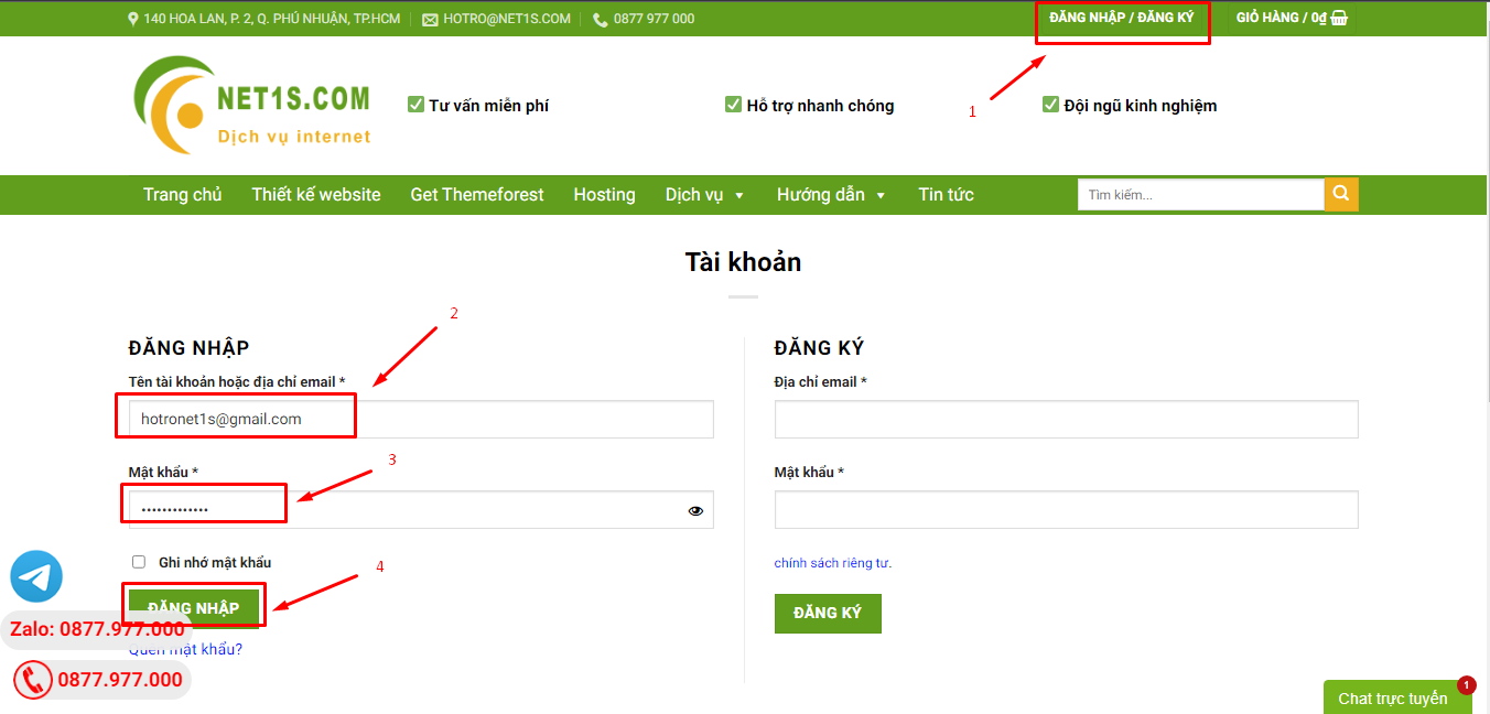
1. Bấm Đăng nhập/đăng ký.
2. Điền thông tin email, mật khẩu đã mua hàng -> bấm Đăng nhập.
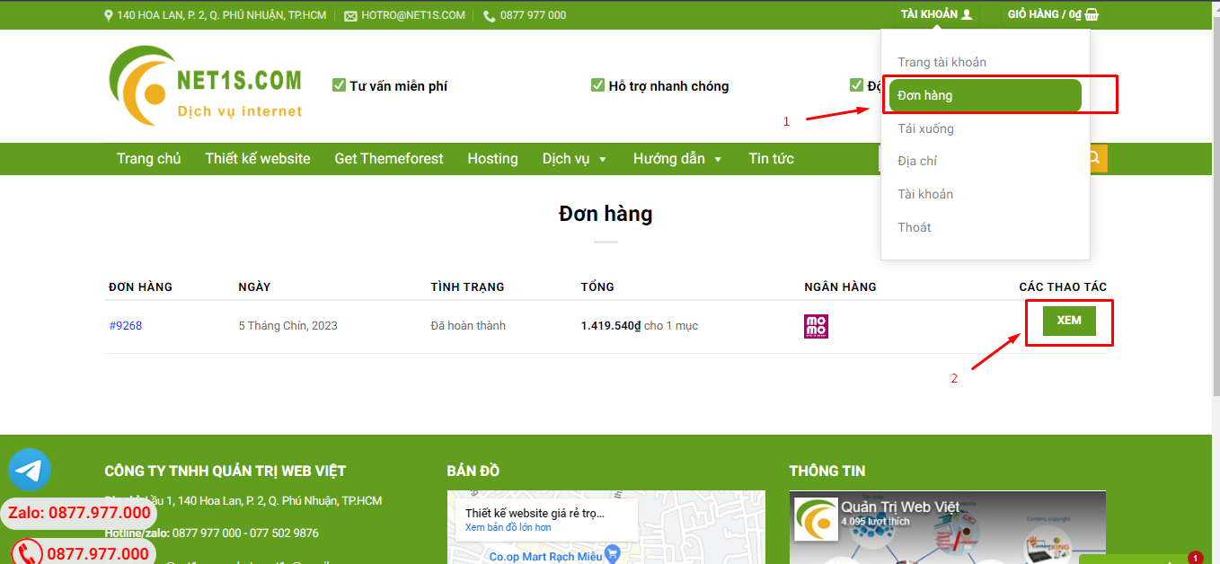
3. Di chuột đến mục Tài khoản -> Đơn hàng -> bấm vào Xem ở đơn hàng đã mua.
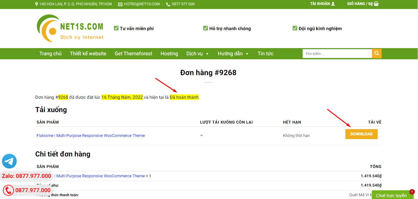
4. Đơn hàng hiển thị tình trạng Đã hoàn thành -> bấm vào Download để tải sản phẩm về.
1. Bấm Thêm vào giỏ hàng -> bảng thông tin giỏ hàng sẽ hiển thị góc trên bên phải.
2. Bấm Thanh toán.
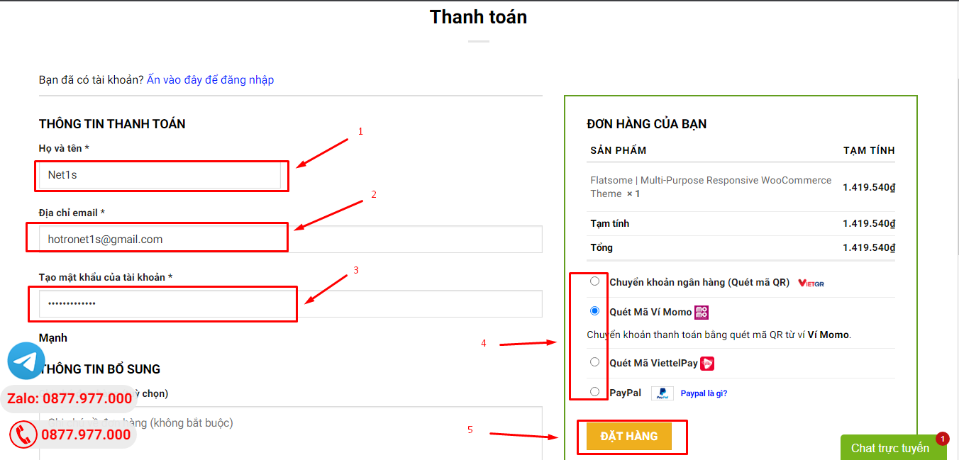
3. Điền thông tin thanh toán gồm: tên, email, mật khẩu.
4. Chọn phương thức thanh toán có hỗ trợ gồm: Chuyển khoản ngân hàng (quét mã QR), quét mã Momo, quét mã Viettelpay, Paypal.
5. Bấm Đặt hàng để tiếp tục.
5. Thanh toán bằng cách quét mã QR (Nội dung chuyển khoản và số tiền sẽ tự động được tạo), hoặc chuyển khoản nhập số tiền và nội dung chuyển khoản như hướng dẫn.
6. Sau khi thanh toán xong đơn hàng sẽ được chúng tôi xác nhận đã hoàn thành và bạn có thể vào mục Đơn hàng để tải sản phẩm đã mua về.
Sản phẩm tương tự
Codecanyon
Codecanyon





![WooCommerce Binary Multi Level Marketing [MLM] WooCommerce Binary Multi Level Marketing [MLM]](https://market-resized.envatousercontent.com/codecanyon.net/files/347889930/WooCommerce-Binary-Multi-Level-Marketing-banner.png?auto=format&q=94&cf_fit=crop&gravity=top&h=8000&w=590&s=d23d5d261a56512423f42c2609169462651c3b7f973b1cfabfaa68eeab4acb78)


