- Dịch vụ khác (7)
- Wordpress (33314)
- Plugin (8228)
- Apps Mobile (364)
- Codecanyon (4157)
- PHP Scripts (763)
- Plugin khác (2537)
- Whmcs (67)
- Wordpress.org (340)
- Theme (25086)
- Blogger (2)
- CMS Templates (545)
- Drupal (3)
- Ghost Themes (3)
- Joomla (19)
- Magento (2)
- Muse Templates (37)
- OpenCart (19)
- PrestaShop (9)
- Shopify (1142)
- Template Kits (6284)
- Theme khác (379)
- Themeforest (7443)
- Tumblr (1)
- Unbounce (3)
- Website & Html Templates (9195)
- Admin Templates (832)
- Email Templates (228)
- Site Templates (7652)
- Plugin (8228)
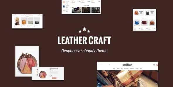
Material Design is the hottest trend in responsive website development. Google’s Material Design language is the future of adaptive/responsive web design. It not only provides a colorful, flat design that users are familiar with, but also provides a natural more organic user experience that will keep visitors on your webpage and experiencing the conversation. Premium WMD theme offers a full Google Material Design experience.
Not just responsive. Smart responsive.
Please check this screenshot to see how it work: http://landing.zootemplate.com/shopify/shopify-novetty-rwd.gif
Leather takes your store to a new level of responsiveness. Its cutting-edge architecture optimizes your site for desktops and provides an “app-like” experience on smartphones and tablets. By leveraging Bootstrap’s tools, Novetty dynamically loads responsive content that is appropriate for different users’ browsers. It also displays beautiful off-canvas menus on mobile.
Enhanced Catalog for a unique shopping experience.
Leather comes with a powerful Layered Navigation sidebar. It is sleek, lightweight and because it’s off-canvas it stays out of the way until needed. The implemented AJAX technology allows filtering and sorting products without page reloading. And with the included Isotope Library, any layout rearrangement like when switching from grid to list or opening the filters pane is gracefully animated. It just seems magical.
Off-Canvas Shopping Cart
Allow your clients to see the products they’ve selected in a glance, with the possibility to add or remove products without being forced to navigate back and forth across the site.
Tailored Quick View
Shoppers love to get a good visual sense of the product before purchasing. Provide a beautiful user experience while driving all eyeballs to the products you’re offering.
Key features
- Well Documented
- Powerful admin control panel
- Amazing Slider built-in
- Header Style Option allows you to change the header style
- Fully Customisable Control the look of every aspect of your store. Extensive theme editor lets you control the colour style fonts etc.
- Unlimited colours Change virtually every colour option in your store
- Retina & Fully Responsive Responds to the screen resolution, works on all desktop and mobile devices.
- Fully Responsive Grid – forget about setting column numbers for each breakpoint. Just set a minimum width for your products and they will automatically adjust to any screen size.
- Newsletter Popup supported
- Advanced Shopping Cart in header
- Sticky Menus built-in Your viewers/customers will navigate more quickly through your site
- Mega Menus built-in – Mega Menus & Vertical Mega Menus – Allow you add categories, custom static block (video, banner, links..), CMS to the navigation
- Off Canvas Menus On small screens, the main menu become off-canvas (app-like sliding menu)
- Smart menus built-in Allow you to show the categories as a drop down menus or accordion menus on the sidebar
- Ajax Add to Cart, Ajax Wishlist You can add products to cart, wishlist and compare without leaving current page.
- Ajax shop by price slider You can now adjust price range with a fancy slider without refreshing a page
- Ajax Paging & Ajax Toolbar built-in
- Previous & Next functionality for the product view page Now you can navigate to next and previous products without going back to listing page.
- Quick View built-in Allows you to view product details without leaving current page
- Slider for Up-sell Products and Related Products blocks. Now you can show as much related and up-sell products as you want.
- Alternative Images built-in
show alternative product images on mouse hover - Product zoom built-in Allow your customers to take a closer look at the product
- Product thumbnail Slider built-in Allow you slide all images of the product
- Best Seller Product
- Product label “New” and “Sale” on product page, in categories and on other product listings (editable from admin panel).
- Powerful Product Pro Widget built-in A $200 value that is free when you purchase this theme
- Parallax Effect Widget built-in Choose to set a background image, add text & additional images
- Google fonts integrated Choose from over 650 google web fonts
- Back to top button
- Background patterns and color chooser Easy to change or upload your background images, you can set unlimited for your store
- Tabs/accordion Tabs smoothly turns into accordion on narrow screens
- Instant Grid/List change – No more page reloading or waiting AJAX request. Just click the grid or list button and your products will change instantly with a beautiful animation.
- “Additional Information” tab for individual product attributes Create and display custom product attributes
- Brand Logo Slider on product page. Logo can be a link to any page (to category with products from that brand, to search results or to any custom CMS page). Alternatively brand names can be displayed instead of logo images
- Blog Post Slider built-in
- Customizable Image Size on product page. Specify any size you like, images don’t have to be square – you can keep the aspect ratio
- Lazy loading If enabled for product sliders, images outside of viewport will not be loaded (to improve performance) before user scrolls to them
- FontAwesome icons fully integrated
- One-click import Import CMS blocks and pages with sample content from the demo
- Cross Browser Support Chrome, Safari, Mozilla Firefox, IE 10+
- Well-comment CSS and PHP code files
Our Featured Products
Tặng 1 theme/plugin đối với đơn hàng trên 140k:
Flatsome, Elementor Pro, Yoast seo premium, Rank Math Pro, wp rocket, jnews, Newspaper, avada, WoodMart, xstore
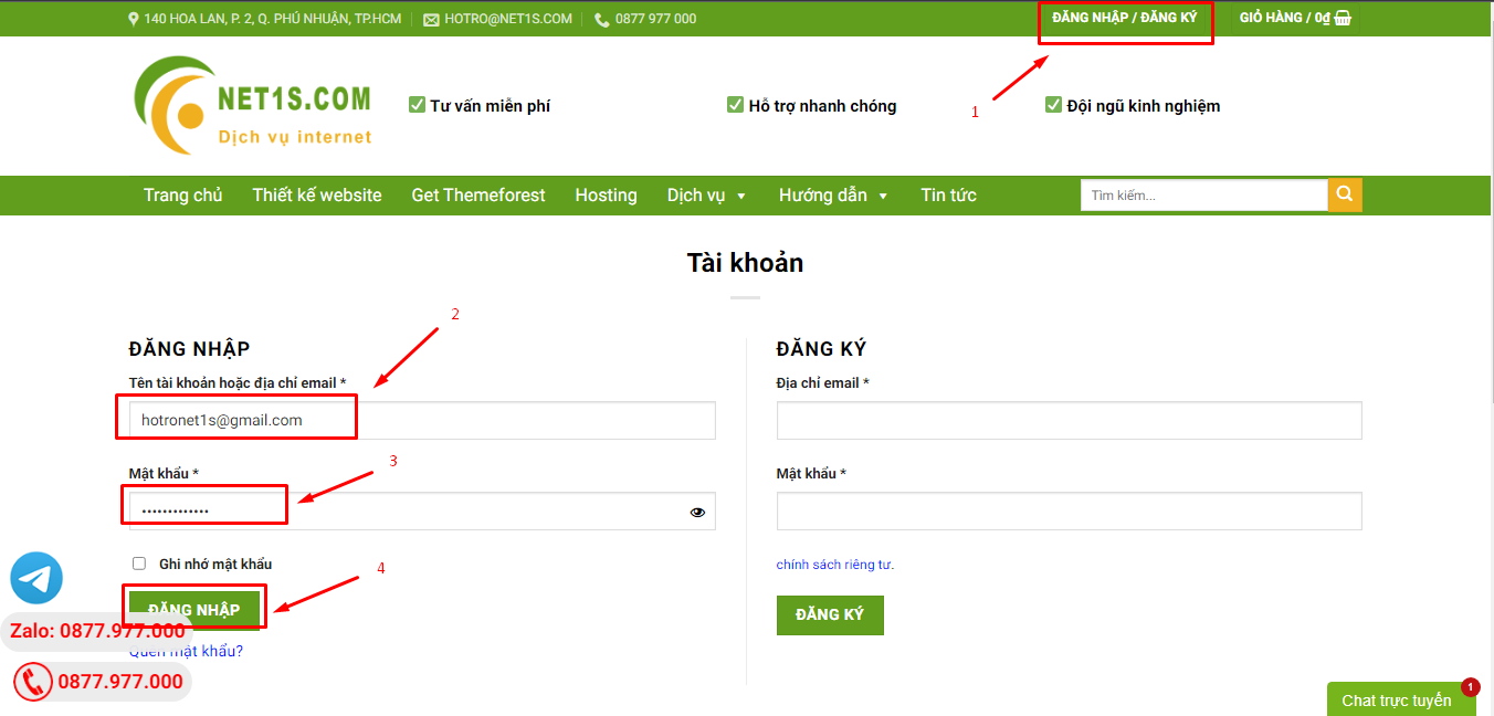
1. Bấm Đăng nhập/đăng ký.
2. Điền thông tin email, mật khẩu đã mua hàng -> bấm Đăng nhập.
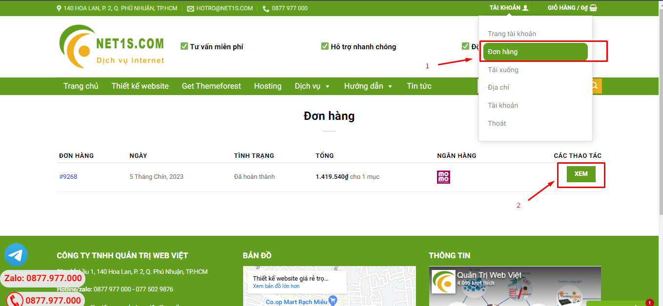
3. Di chuột đến mục Tài khoản -> Đơn hàng -> bấm vào Xem ở đơn hàng đã mua.
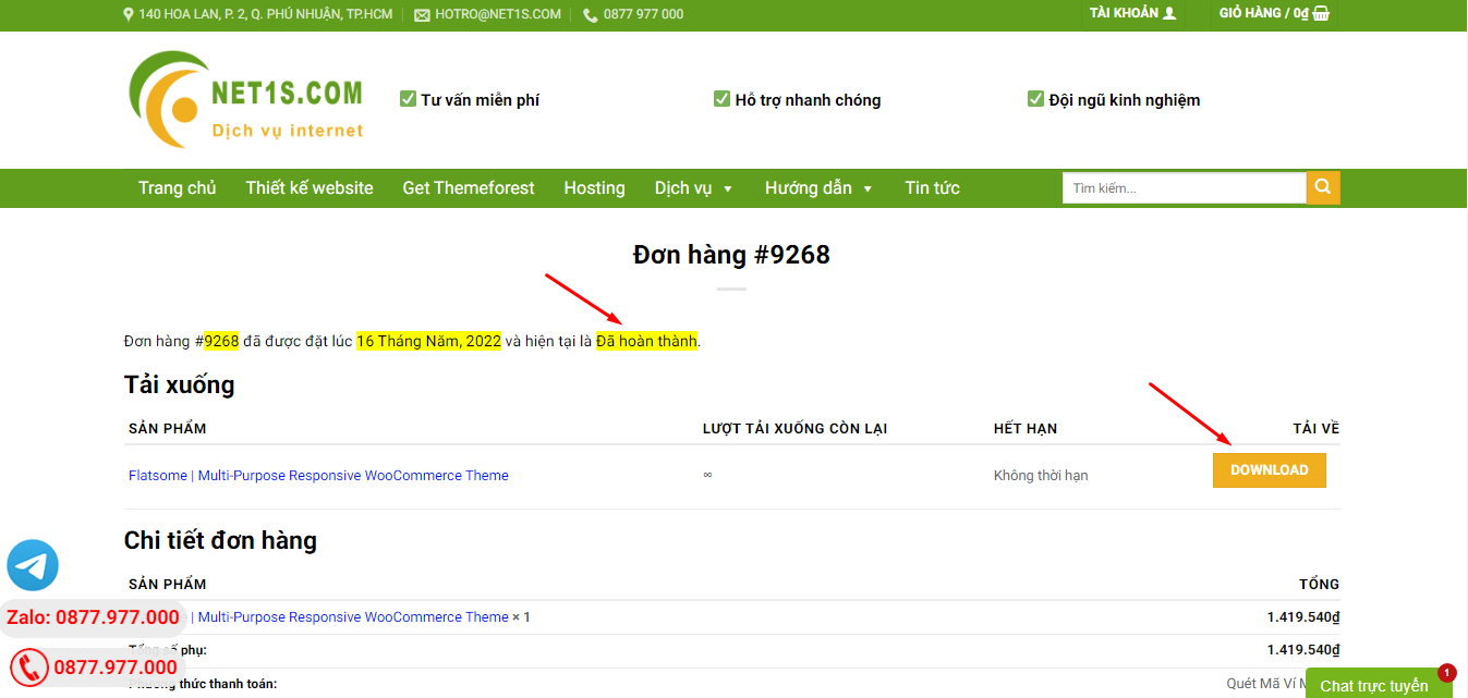
4. Đơn hàng hiển thị tình trạng Đã hoàn thành -> bấm vào Download để tải sản phẩm về.
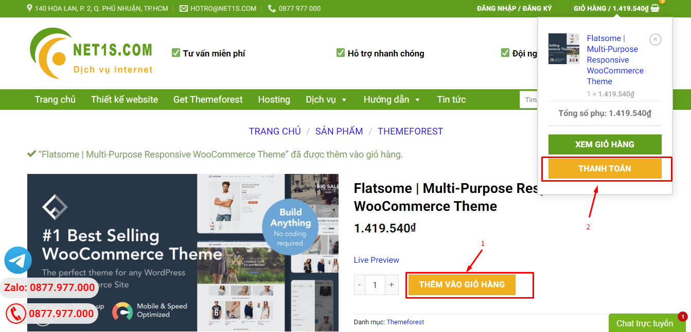
1. Bấm Thêm vào giỏ hàng -> bảng thông tin giỏ hàng sẽ hiển thị góc trên bên phải.
2. Bấm Thanh toán.
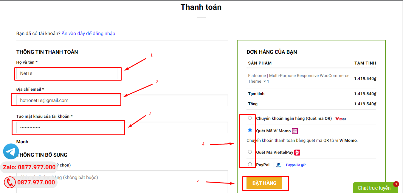
3. Điền thông tin thanh toán gồm: tên, email, mật khẩu.
4. Chọn phương thức thanh toán có hỗ trợ gồm: Chuyển khoản ngân hàng (quét mã QR), quét mã Momo, quét mã Viettelpay, Paypal.
5. Bấm Đặt hàng để tiếp tục.
5. Thanh toán bằng cách quét mã QR (Nội dung chuyển khoản và số tiền sẽ tự động được tạo), hoặc chuyển khoản nhập số tiền và nội dung chuyển khoản như hướng dẫn.
6. Sau khi thanh toán xong đơn hàng sẽ được chúng tôi xác nhận đã hoàn thành và bạn có thể vào mục Đơn hàng để tải sản phẩm đã mua về.
