- Dịch vụ khác (7)
- Wordpress (33139)
- Plugin (8228)
- Apps Mobile (364)
- Codecanyon (4157)
- PHP Scripts (763)
- Plugin khác (2537)
- Whmcs (67)
- Wordpress.org (340)
- Theme (24911)
- Blogger (2)
- CMS Templates (545)
- Drupal (3)
- Ghost Themes (3)
- Joomla (19)
- Magento (2)
- Muse Templates (37)
- OpenCart (19)
- PrestaShop (9)
- Shopify (1141)
- Template Kits (6230)
- Theme khác (379)
- Themeforest (7435)
- Tumblr (1)
- Unbounce (3)
- Website & Html Templates (9083)
- Admin Templates (820)
- Email Templates (228)
- Site Templates (7552)
- Plugin (8228)
Grand Conference | Event WordPress
1.501.609₫ Giá gốc là: 1.501.609₫.300.322₫Giá hiện tại là: 300.322₫.
Grand Conference Theme Overview
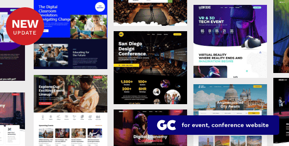
Grand Conference is a responsive modern WordPress theme for conference & event web site. Built with the latest WordPress technology. Grand Conference support responsive layout so it looks great on all devices. It has predefined styling & templates and many features built specially for conference, event organiser or all meetup, seminar events which can be imported with one click.
Features
Make your website uniquely
- 30+ predesign pages for conference & event web site. As uniquely showing conference & event informations are very crucial especially when & where questions, we focus on creating the various predesign pages for conference & event web site including sessions, schedule day, speakers, tickets table and many more. Moreover, simple steps are required to create with our pre-defined pages and content builder.
- The smoothest parallax scrolling ever Tell your stories with our provided smooth parallax scrolling with rendering performance of 60fps
- Video Parallax Make your website more attractive from your visitors by video parallax.
Design for conference & event website so your visitors can find all information quickly
- Filterable session topics. not only you can easily create sessions on your event conference. You can also organise them to multiple topics. So your visitor can easily filter to topic they interest and it helps increase chances of buying your event’s tickets!
- Conference Sessions by Days You can organise each sessions into multiple days and it’s automatically sort all sessions by start time of each session.
- 3 Schedule Layouts We want to make sure your visitors can easily find informations they want to know about your conference sessions so you provided various layouts to display sessions.
- Extensive Speakers Grid & Informations You can customise grid layout of speakers contents. Select from 2 to 5 columns layouts. Single speaker page also support social media links and all sessions by selected speaker.
- Location & Venue The important part of conference & event website is to information about were it happens and venue for example hotel. Theme provided all these layouts to displays map with locations and hotel informations beautifully.
- MailChimp newsletter support Provide option for your customers to subscribe to mailing list so you can send them promotions, early bird ticket or conference related news easily using mailChimp platform.
Various Booking Options
- Woocommerce product When your customer complete booking form. It will add selected product to cart and your customer can checkout and pay using online payment options from Woocommerce.
- Custom URL When your customer complete booking form. It will redirect your customer to entered URL page.
Various Options for getting started
Uniquely show your conference & event web site using a variety of sessions and speakers layouts or built-in content builder.
- 30+ predesign pages for conference & event web site. As uniquely showing conference & event informations are very crucial especially when & where questions, we focus on creating the various predesign pages for conference & event web site including sessions, schedule day, speakers, tickets table and many more. Moreover, simple steps are required to create with our pre-defined pages and content builder.
- Session Each session for example keynote presentation with detailed information like session start time – end time, speaker etc.
- Session Topics Once you created sessions, you can organise them into multiple topics so use can filter it on schedule page.
- Schedule Days Generally each event or conference will be organised multiple days. So you group each sessions to selected day so use can see what’s session available on which day on schedule page.
- Awesome 8 Predefined Styling Get your website working in short time with our pre-defined 8 demos layouts.
- Only One Click for Importing Demo Contents Quickly and easily import our demo contents including pages, posts, sliders, widgets, theme options and other settings with only one click.
- Share to Social Networks Easily share pages and posts through major social networks sites including Facebook, Twitter etc.
- 10 Blog Templates Multiple single blog post layouts are the powerful features to use in different purposes. Post content is flexible to display with images, gallery slider show or with other video source ex. Youtube, Vimeo, and self-hosted video Also, blog post support various content including photo, gallery, video, soundcloud etc.
- 8 Menu Layouts with 8 menu styles and various customizable options so you can easily create your own menu design.
Other Features
- One Page Navigation Support Easily create your modern one page parallax site or micro site using drag and drop builder with custom menu system.
- Optimization for Google Mobile Compatibility Check Your site’s search by Google will more visible and have better performance for mobile users. Google updated their search algorithm to give preference to websites that are optimized for proper display on mobile/handheld devices.
- Search Engine Optimization (SEO) Theme has been built using semantic HTML code and CSS, allowing search engines crawl and index your web page easily.
- Google Map Styles Changing Google Maps color scheme easy using styling from snazzymaps
- Sharp Font Icons Font icons are always crystal clear and look perfect on all devices’ screens and sizes. In addition, font icon helps to speed up your load times of your site.
- Retina Ready Ensure that your images and elements are sharp and gorgeous on Retina and high resolution displays.
- Custom Styles Custom your styles with custom CSS in theme options. Without changing core theme, no worry for upgrading the theme anymore
- Fully Customizable With our flexible framework, this theme is the powerful theme to display awesome and various sessions and speakers options; for example, grid, classic with sidebar layout etc. Not surprisingly, no two versions of theme will ever look the same.
- Shortcodes Easily create your own custom page with our Shortcodes. Any elements you like in this theme, you can add on your page.
- Style shortcodes ex. dropcap etc
- Built-in Many Shortcodes
- Built-in Shortcode Generator plugin
- Column shortcodes ex. 2, 3, 4, 5 columns
- Translation Support Theme is included .mo and .po language files. Moreover, theme is compatible with WPML plugin, allowing you to translate your site to any language or multiple languages.
- Custom Sidebars Easily creating your own custom sidebars without touching any code. Moreover, simply set the different sidebars to perfectly match to each page.
- Unlimited sidebar Create and select sidebar for each of your page
Amazing Builder
- Intuitive Live Content Builder Keynote app-like interface with live preview so anyone can create beautiful page easily. This Content Builder includes both Live Mode and Classic Mode. For Live Mode, you can see the results of change instantly. But if you familiar with our builder, you can work with Classic Mode to develop faster.
- Easy to Use Keynote-like interface Intuitive content builder with keynote app-like interface. Clear overview content inspector and preview changes instantly.
- Add & Manage Contents Visually Instead of showing icon, when you select contents to add to page, it display screenshot of content visually.
- Responsive Preview See and Work with responsive layout instantly within content builder.
- Drag & Drop Content Builder Create your multiple layouts in a single page without touching theme code by dragging and dropping our various pre-defined content modules including sessions, speakers, gallery, blog, testimonials and etc. Let’s try the powerful built-in builder.
- Save as Template Page can be saved as template in order to apply to new pages. This saves time to develop new page.
- Fully integrated with WordPress Customizer Modify Appearance settings in a live preview. No matter what you change elements colors, background, typography, layout type, text or images, you will see the results instantly.
- Develop your website to be responsive easily. Just only one click in Live Customizer to show the results in responsive view including on laptops, tablet or mobile phone.
- Image Options Right Click and Image Dragging Protection can easily enable only one click.
- Styled Typography in Live Preview Over 500+ Google Fonts are included with all styles and Font changes will be shown in live preview via Customizer. You can change font size, style, color using without touching code.
- Easily set different typography of Main Content Font Family, Main Content Font Size, H1-H6 Font Family, H1-H6 Font Weight, H1-H6 Font Spacing, and H1-H6 Font Size.
- Simply change Button Font Family.
- Also, simply set dissimilar typography of Menu Font Family, Menu Font Size, Menu Padding, Menu Font Weight, Menu Font Spacing, and Menu Font Text Transform.
- Also, easily set SubMenu Font Size, SubMenu Font Weight, SubMenu Font Spacing, and SubMenu Text Transform (None, Uppercase, Lowercase, and Capitalize).
- Simply change Side Menu Font Family, Side Menu Font Size, Side Menu Font Weight, Side Menu Font Spacing, Side Menu Text Transform (None, Uppercase, Lowercase, and Capitalize).
- Moreover, effortlessly change Page Header Padding Top, Page Header Padding Bottom, Page Title Font Size, Page Title Font Weight, Page Title Font Spacing and Page Title Text Transform (None, Uppercase, Lowercase, Capitalize)
- In addition, easily change Content Builder Header Font Size and Content Builder Header Text Transform (None, Uppercase, Lowercase, Capitalize)
- Furthermore, easily change Page Title Font Size, Page Tagline Font Weight, Page Tagline Font Spacing and Page Tagline Text Transform (None, Uppercase, Lowercase, Capitalize)
- Last but not least, easily change Widget Title Font Family, Widget Title Font Size, Widget Title Font Weight, Widget Title Font Spacing and Widget Title Text Transform (None, Uppercase, Lowercase, and Capitalize).
- Amazing Backgrounds Easily applying images, patterns and colors in background of your site. Also, various repeat options are available.
- Easily set different background of Main Content Background Color, Input and Textarea Background Color, and Button Background Color.
- Besides, simply set varying background of Menu Background Color.
- Also, effortlessly set Sub Menu Hover State Background Color and Sub Menu Background Color.
- Moreover, easily change Top Bar Background Color.
- In addition, simply change Side Menu Background Color
- Also, easily change Search Input Background Color.
- Moreover, effortlessly set Page Header Background Color, and Footer Background Color.
- Unlimited Colors Easily control your elements colors of your website using color picker
- Simply change dissimilar color of Main Content Background Color, Page Content Font Color, Page Content Link Color, Page Content Hover Link Color, H1-H6 Font Color, and Horizontal Line Color.
- Easily set different colors of Input and Textarea Background Color, Input and Textarea Font Color, Input and Textarea Border Color, Input and Textarea Focus State Color, Button Background Color, Button Font Color, and Button Border Color.
- Moreover, simply set unlike color of Menu Font Color, Menu Hover State Font Color, Menu Active State Font Color and Menu Bar Border Color
- Also, submenu can be set including Sub Menu Font Color, Sub Menu Hover State Font Color, Sub Menu Hover State Background Color, Sub Menu Background Color, and Sub Menu Border Color
- Easily change Mega Menu Header Font Color and Mega Menu Border Color.
- Top Bar Background Color and Top Bar Menu Font Color can be changed easily.
- Also, easily change Side Menu Background Color, Side Menu Font Color, and Side Menu Hover State Font Color.
- Effortlessly change Search Input Background Color and Search Input Font Color.
- Simply change Page Header Background Color, Page Title Font Color, and Page Tagline Font Color.
- Easily change Sidebar Font Color, Sidebar Link Color, Sidebar Hover Link Color and Sidebar Widget Title Font Color.
- Easily change Page Footer Background Color, Footer Font Color, Footer Link Color, Footer Hover Link Color, Footer Border Color and Footer Social Icon Color.
- Responsive Design With users’ behavior focus, every pages are designed to look great on all devices no matter what devices users are on laptops, tablet or mobile phone. In case, you would like to deactivate responsive feature, only one click is required in your live customizer backend.
- Frame Frame can be enable for site layout by only one click. Also, you can choose easily the Frame Color by the color picker.
- Boxed & Wide Layout Effortlessly select the boxed and wide layout in live customizer which reflect the result back to you instantly.
- Navigation
- General
- Menu LayoutVarious options to choose your menu layout; for instance, Left Align, Center Align, Center Logo + 2 Menus, Hamburger Menu + Side Menu, Hamburger Menu + Fullscreen Menu, and Left Vertical.
- Sticky Menu & Smart Sticky Menu Only one click is required to display main menu fixed when scrolling and to make menu displays when scroll down and hide when scroll up. Moreover, Light & Dark Sticky Menu Color Scheme is available to match your style in your web site.
- Typography
- Easily change Menu Font Family, Menu Font Size, Menu Padding, Menu Font Weight, Menu Font Spacing, and Menu Font Text Transform.
- Colors
- Simply change Menu Background, Menu Font Color, Menu Hover State Font Color, Menu Active State Font Color, and Menu Bar Border Color.
- Sub Menu Submenu can be set including SubMenu Font Size, SubMenu Font Weight, SubMenu Font Spacing, SubMenu Font Text Transform, Sub Menu Font Color, Sub Menu Hover State Font Color, Sub Menu Hover State Background Color, Sub Menu Background Color, and Sub Menu Border Color.
- Mega Menu Theme comes with mega menu support so you can display navigation links into columns which allow you to organize large number of menu items
- Change Mega Menu Header Font Color and Mega Menu Border Color by color picker with ease
- Top Bar
- Only one click is required for displaying Top Bar above main menu.
- In addition, Top Bar Background Color and Top Bar Menu Font Color can be changed easily.
- Contact Info Contact Hours and Contact Phone Number can be set. Moreover, only one click is required for opening Top Bar Social Icons link in new window.
- Side Menu
- Only one click is required to enable Side Menu on Desktop, to display search form in header of side menu, to display search result instantly while typing, and to display galleries when side menu is opened.
- Also, effortlessly change Side Menu Font Family, Side Menu Font Size, Side Menu Font Weight, Side Menu Font Text Transform (None, Uppercase, Lowercase, Capitalize), and Side Menu Font Spacing.
- Easily change Side Menu Background Color, Side Menu Font Color and Side Menu Hover State Font Color, Search Input Background Color, and Search Input Font Color by color picker
- Header
- Background
- Effortlessly change Page Title Background Image Height in percentage.
- Only one click is required to enable add Parallax Effect to header background image when scrolling pass it.
- Easily change Page Header Background Color by color picker.
- Page Title
- Effortlessly change Page Header Padding Top, Page Header Padding Bottom, Page Title Font Size, Page Title Font Weight, Page Title Font Spacing and Page Title Text Transform (None, Uppercase, Lowercase, Capitalize)
- Easily change Page Title Font Color by color picker
- Content Builder Header
- Easily change Content Builder Header Font Size and Content Builder Header Text Transform (None, Uppercase, Lowercase, Capitalize).
- Page Tagline & Sub Title
- Easily change Page Tagline Font Color by color picker.
- In addition, easily change Page Title Font Size, Page Tagline Font Weight, Page Tagline Font Spacing and Page Tagline Text Transform (None, Uppercase, Lowercase, Capitalize).
- Sidebar
- General
- Only one click is required to display sidebar fixed when scrolling.
- Typography
- Easily change Widget Title Font Family, Widget Title Font Size, Widget Title Font Weight, Widget Title Font Spacing and Widget Title Text Transform (None, Uppercase, Lowercase, Capitalize).
- Color
- Easily change Sidebar Font Color, Sidebar Link Color, Sidebar Hover Link Color and Sidebar Widget Title Font Color by color picker
- Footer
- General
- Easily set Footer Sidebar Columns to Hide Footer Sidebar or 1-4 columns
- Only one click is required to set the option to open footer social icons link in new window
- Colors
- Easily change Footer Background, Footer Font Color, Footer Link Color, Footer Hover Link Color, Footer Border Color and Footer Social Icon Color by color picker
- Copyright
- Easily enter your Copyright Text and also select Copyright Right Area Content (Social Icons, Footer Menu)
- Only one click is required to enable go to top button at the bottom of page when scrolling.
- Gallery
- General
- Easily sort gallery images by drag&drop.
- Effortlessly uploading large photos set With multiple uploader support for gallery admin
- Lightbox
- 5 color skins of lightbox can be applied for lightbox.
- Effortlessly adjust lightbox overlay opacity in this customizer.
- Only one click is required to display image caption under the image in lightbox mode and to display image lightbox in horizontal gallery template.
- Easily align the lightbox thumbnails to be horizontal alignment or vertical alignment, or No Thumbnail
- Blog
- General
- Only one click is required to enable the display post full content in blog page (excerpt blog grid layout).
- Easily adjust the page layout for displaying archive page, category page and tag page (Grid, Grid + Right Sidebar, Grid + Left Sidebar, Right Sidebar, Left Sidebar and full width.
- Easily change post category link font color by color picker.
- Single Post
- Only one click is required to enable the display featured image as post header background, the display featured content (image or gallery) in single post page, the display post tags on single post page, the display about author on single post page, the display related posts on single post page, and the display sharing buttons on single post page content.
- Shop
- Layout
- Easily adjust page layout for displaying shop’s products page (Fullwidth, with sidebar) and also the number of product items you want to display per page.
- Single Product
- Easily change the product price font color by color picker.
- Only one click is required to display related products on single product page.
- Menus Easily design your own
with 24 pre-defined options. Also, rearrange elements of the headers sections, change position of logo, change colors, and apply image, social icons, taglines & secondary top menus. - Menu Locations
- Theme supports 4 menus including Primary Menu, Secondary Menu, Side (Mobile) Menu and Footer Menu. You can select which menu appears in each location and you can also place menus in widget areas with the custom menu widget.
- Easily order submenus by drag&drop as following menu.
- Features Menu
- Main Menu
- One Page Menu
- Side Mobile Menu
- Top Menu
- Widgets We provided a variety of custom widgets to make your life easier including Custom About Me, Custom Category Posts, Custom Flickr, Custom Instagram, Custom Map, Custom Menu, Custom Popular Posts, Custom Recent Posts, Custom Social Profiles. Just drag and drop custom widgets to activate and configure in any sidebars you build.
- Static Front Page
- Easily select the options of the Front page to display your latest posts or a static page and also apply the front page and posts page to specific page.
- Awesome Page/Post Options
- Page options is in menu with the Theme Options. Page options is for configuring the value for individual page or post which affect the page or post you set them on. These will override theme options which allows you to have a unique page or post outside of your global settings. This various options work together to allow you to build incredible websites.
- Post Options
- Set layout of the single post page including Fullwidth, with left sidebar, and with right sidebar.
- Specify featured content type for the post including image, gallery, Youtube Video and Vimeo Video. Different content type will be display on single post page.
- Specify Categories including Photography, Lifestyle, Travel and Uncategorized
- Specify multiple tags, featured image, excerpt and shortcode
- Easily manage categories and tags.
- Page Options
- Only one click to make main menu in transparent and also hide default page header.
- Page Tagline is available under page title (HTML code also supports)
- Specify page sidebar by selecting provided page template (end with “Sidebar” only)
- Customize the page’s menu in case you would like to display main menu other than default one.
- Specify parent of the page, template of the page and ordering.
- Specify featured image and discussion
- Custom Page Templates
- Blog Fullwidth
- Blog Full + Grid Fullwidth
- Blog Full + Grid Left Sidebar
- Blog Full + Grid Right Sidebar
- Blog Grid
- Blog Grid Left Sidebar
- Blog Grid Right Sidebar
- Blog Left Sidebar
- Blog Right Sidebar
- Page Left Sidebar
- Page Right Sidebar
- Awesome Session & Speakers Options
- Display various session attribute including number of speakers, start time, end time, location and session description using excerpt field.
- Filterable session topics. not only you can easily create sessions on your event conference. You can also organise them to multiple topics. So your visitor can easily filter to topic they interest and it helps increase chances of buying your event’s tickets!
- Conference Sessions by Days You can organise each sessions into multiple days and it’s automatically sort all sessions by start time of each session.
- 3 Schedule Layouts We want to make sure your visitors can easily find informations they want to know about your conference sessions so you provided various layouts to display sessions.
- Extensive Speakers Grid & Informations You can customise grid layout of speakers contents. Select from 2 to 5 columns layouts. Single speaker page also support social media links and all sessions by selected speaker.
- Location & Venue The important part of conference & event website is to information about were it happens and venue for example hotel. Theme provided all these layouts to displays map with locations and hotel informations beautifully.
- Awesome Blog Options
- 8 Page Layouts to choose from; Blog Fullwidth, Blog Full + Grid Fullwidth, Blog Full + Grid Left Sidebar, Blog Full + Grid Right Sidebar, Blog Grid, Blog Grid Left Sidebar, Blog Grid Right Sidebar, Blog Left Sidebar, Blog Right Sidebar, Blog Split Screen
- All 8 Page layouts can have left or right sidebar or be full width.
- 3 post types are available including image, gallery, Youtube Video, and Viemo Video.
- Post sharing box with social icons.
- Threaded Comments.
- Author profile page.
- Testimonial To gain trust from your customer, testimonials are very important. This theme allow you to specify Customer Name, Customer Position in company, Company Name, Company Website URL and Testimonial Category.
- Support Featured image.
- Manage and maintain Testimonial Category (Group of Testimonial) easily.
- Team Member To show your team member, this theme supports lots of social profile information such as Position and Role, Facebook URL, Twitter URL, Google+ URL and Linkedin URL.
- Support Featured image
- Manage and maintain Team Category (Group of Team) easily.
- Ticket Easily show your ticket/pricing options in your website. Just enable this ticket featured by only one click. Then, specify currency, price, pricing plan features, pricing button text and booking method
- Manage and maintain Pricing Category (Group of Pricing) easily.
- Other
- Compatible with latest WordPress version
- Built with HTML5 and CSS3
- jQuery Enhancements
- Javascript files are automatically combined and minified for added performance
- WordPress Multisite (WPMU) Tested and Approved
- SEO Optimized, great SEO base already built-in (compatible with SEO Plugins like Yoast)
- Well organized, commented & clean code
- 100% Responsive Theme – and you can easily turn it on or off
- Automatic Theme Updater
- Social Icons and Theme Icons are Font Icons, no Images
- CSS3 animations enable or disable on desktop/mobile
- CSS and javascript compression support
- CSS3 Animations CSS3 animations help to attract the attention of your visitors towards your content by setting type, direction and speed of elements.
- Child Theme support for advanced customization which is not affected by theme future update
- Developed with WordPress best practices
Customer Support
- Once you purchase, you can use our advanced support ticket system to receive professional support that we provided experienced and dedicated support team to ensure you always have the help you and your business needs, right when it needs it most
- The most extensive online & offline documentation are included
- Free Theme Updates – We are endeavoring to improve the quality of our themes by adding new features and removing bugs
- Customer feedback are always welcomed for new features
Integration & Plugin
- Social Media Profiles Support Social Media will help you to promote your online brand, therefore, theme provided the social media channels including
- Google Plus
- Flickr
- Youtube
- Vimeo
- Tumblr
- Dribbble
- Behance
- 500px
- Photo Stream Theme provided the channel to display photo stream before footer area including
- Instagram Photostream
- Flickr Photostream
- Compatible Plugins
- WooCommerce Plugin support for shopping cart feature.
- Easily create and maintain your online shop with WooCommerce integration.
- Plugin is ready designed to assort with the theme
- Display your products based on category, ID or SKU
- Custom featured product slider to display your products
- Flexible setting your shop layout with full width or sidebar template.
- Premium Plugins Included ($34 Value) The 2 most popular slider plugin ($34 FREE) Revolution Slider and iLightbox WordPress plugins are included in theme. Image Lightbox support gesture on touch screen devices
- WPML Plugin Compatibility, allowing you to translate your site to any language or multiple languages.
- Contact Form 7 compatible with full design integration
- Apply Google Maps above contact page form
- Custom Google Map Styling
- Change custom sizes of your map
- Set sidebar or full width of your contact page
- MailChimp for newsletter
- W3 Total Cache plugin support
- Yoast SEO plugin support
- WP Supercache plugin support
Changelog
View Changelog
Tặng 1 theme/plugin đối với đơn hàng trên 140k:
Flatsome, Elementor Pro, Yoast seo premium, Rank Math Pro, wp rocket, jnews, Newspaper, avada, WoodMart, xstore
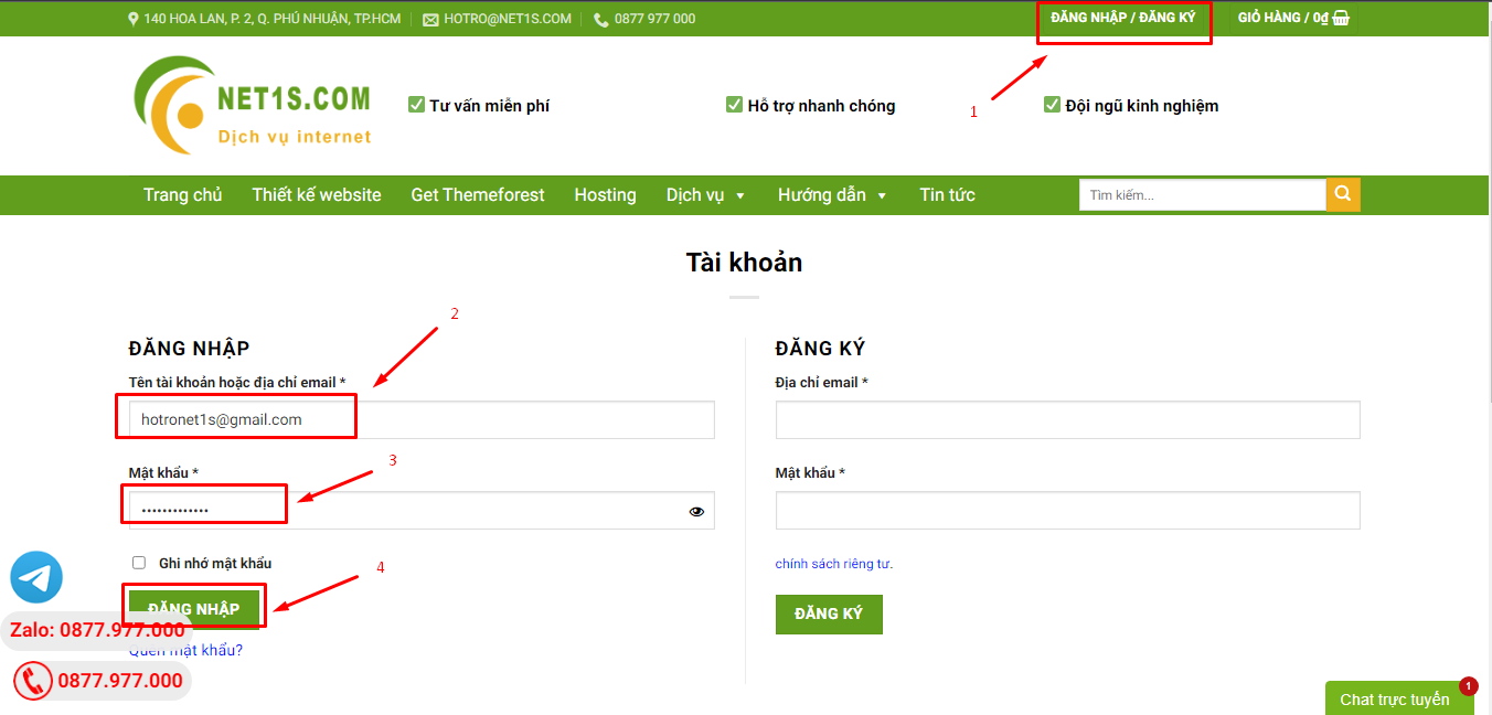
1. Bấm Đăng nhập/đăng ký.
2. Điền thông tin email, mật khẩu đã mua hàng -> bấm Đăng nhập.
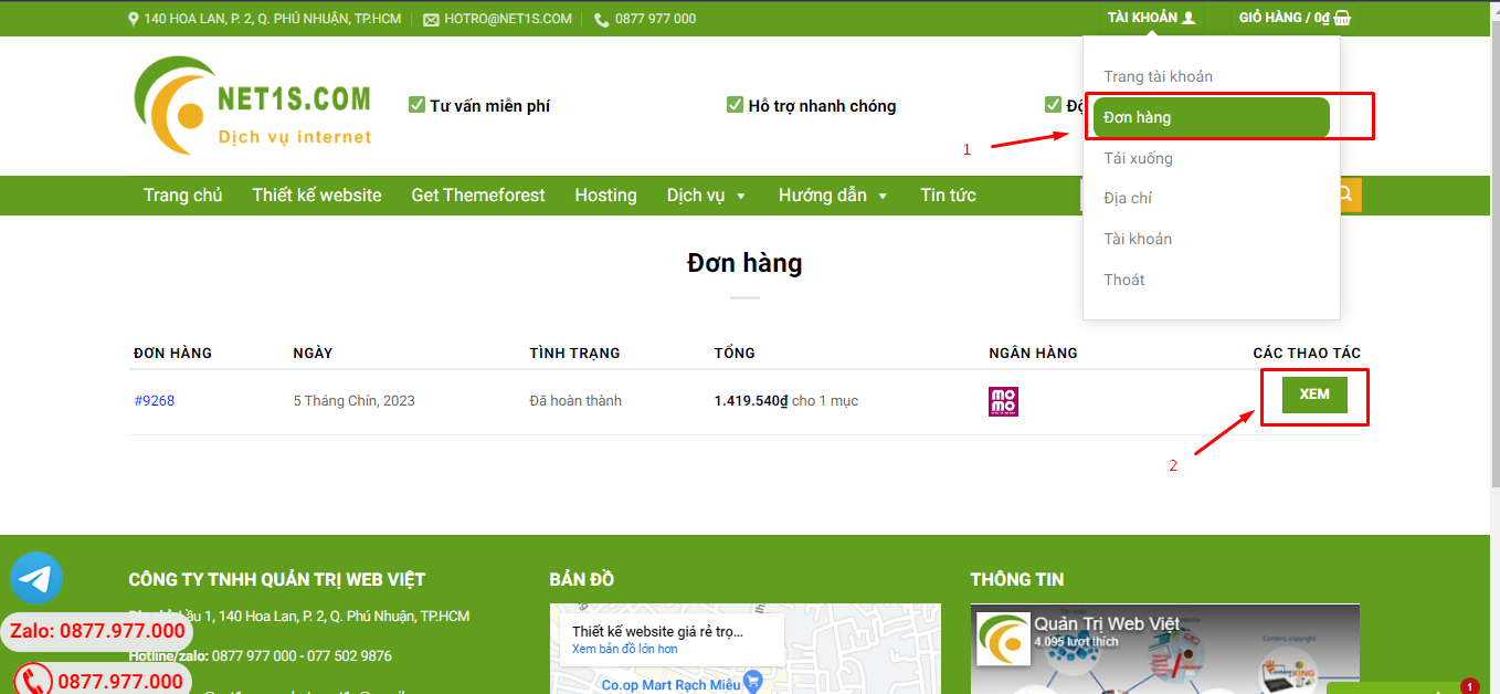
3. Di chuột đến mục Tài khoản -> Đơn hàng -> bấm vào Xem ở đơn hàng đã mua.
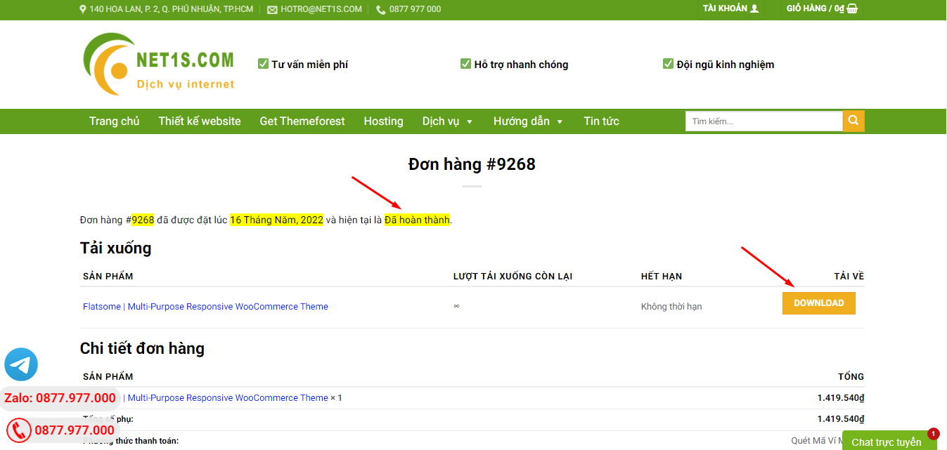
4. Đơn hàng hiển thị tình trạng Đã hoàn thành -> bấm vào Download để tải sản phẩm về.
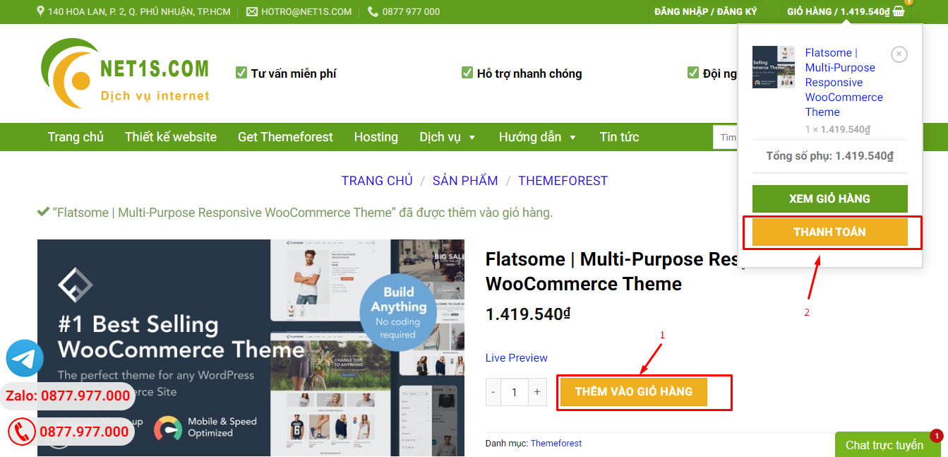
1. Bấm Thêm vào giỏ hàng -> bảng thông tin giỏ hàng sẽ hiển thị góc trên bên phải.
2. Bấm Thanh toán.
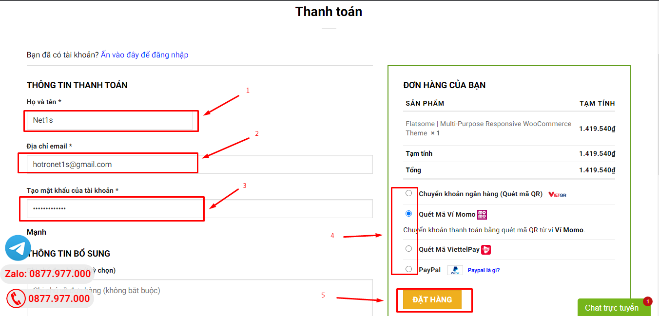
3. Điền thông tin thanh toán gồm: tên, email, mật khẩu.
4. Chọn phương thức thanh toán có hỗ trợ gồm: Chuyển khoản ngân hàng (quét mã QR), quét mã Momo, quét mã Viettelpay, Paypal.
5. Bấm Đặt hàng để tiếp tục.
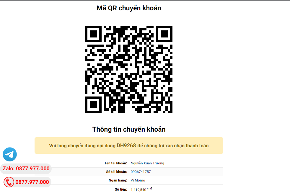
5. Thanh toán bằng cách quét mã QR (Nội dung chuyển khoản và số tiền sẽ tự động được tạo), hoặc chuyển khoản nhập số tiền và nội dung chuyển khoản như hướng dẫn.
6. Sau khi thanh toán xong đơn hàng sẽ được chúng tôi xác nhận đã hoàn thành và bạn có thể vào mục Đơn hàng để tải sản phẩm đã mua về.
